UMass Lowell Dept. of Computer Science
91.461 GUI Programming I
Fall 2015 Semester, Section 201
Prof. Jesse M. Heines
Notes for Class No. 9
Working with Margins, Padding, and Borders
Tuesday, September 29, 2015
A video of this class is (or will be) posted at: http://echo360.uml.edu/heines201516/guiprogramming1.html
Handouts and Materials
Openings / Announcements / Reminders
Questions or issues with Assignment No. 4 on GitHub?
Class Notes
Related reading for this class: CSS3:TMM Ch. 4, 5, & 7
Margins, Padding, and Borders (CSS:TMM Chapter 7)
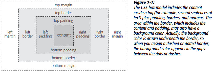
The CSS Box Model


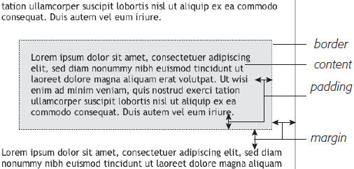
[source of both figures: CSS: The Missing Manual, by David Sawyer McFarland, Fig. 7-1, p. 152 (2nd ed.), p. 194 (3rd ed.)]
- using the the two figures above as examples, these are JPGs that have 2 pixel borders that are added by CSS
- however, these figures are cropped tight to keep the JPG size as small as possible
- that is, the actual edge of the JPG is the dotted lines of the first figure and the text of both figures
- so what did I adjust to display these images so that the border is not right up against the figures’ content?
Additional diagrams and demos
Margin and padding shorthand
- 4 parameters
-> TRBL = top right bottom left
margin: 5px 10px 5px 10px- Dreamweaver requires
px (pixels)
- 2 parameters
-> TB+RL = top and right, then bottom and left
- 1 parameter
-> all four
- the default
margin and padding values are auto, which you can use as well
Margins and padding and their behaviors with various blocks
Note: The excerpts below are from Martin Luther King, Jr.’s “I Have a Dream” speech, delivered August 18, 1963, at the Lincoln Memorial in Washington, D.C. For a recording and full transcript of this speech, please see http://www.americanrhetoric.com/speeches/mlkihaveadream.htm.
- trying to apply margins to a word in a paragraph using:
<span style="margin: 10px ; color: red ; border: 2px dashed blue">millions of Negro slaves</span>
I am happy to join with you today in what will go down in history as the greatest demonstration for freedom in the history of our nation.
Five score years ago, a great American, in whose symbolic shadow we stand today, signed the Emancipation Proclamation. This momentous decree came as a great beacon light of hope to millions of Negro slaves who had been seared in the flames of withering injustice. It came as a joyous daybreak to end the long night of their captivity.
- adding:
display: block
<span style="margin: 10px ; color: red ; border: 2px dashed blue ; display: block">
But one hundred years later, the Negro still is not free. One hundred years later, the life of the Negro is still sadly crippled by the manacles of segregation and the chains of discrimination. One hundred years later, the Negro lives on a lonely island of poverty in the midst of a vast ocean of material prosperity. One hundred years later, the Negro is still languished in the corners of American society and finds himself an exile in his own land. And so we’ve come here today to dramatize a shameful condition.
- changing that to:
display: inline-block
<span style="margin: 10px ; color: red ; border: 2px dashed blue ; display: inline-block">
In a sense we’ve come to our nation’s capital to cash a check. When the architects of our republic wrote the magnificent words of the Constitution and the Declaration of Independence, they were signing a promissory note to which every American was to fall heir. This note was a promise that all men, yes, black men as well as white men, would be guaranteed the “unalienable Rights” of “Life, Liberty and the pursuit of Happiness.”
It is obvious today that America has defaulted on this promissory note, insofar as her citizens of color are concerned. Instead of honoring this sacred obligation, America has given the Negro people a bad check, a check which has come back marked “insufficient funds.”
- what if we use
padding instead of margin?
<span style="padding: 10px ; color: red ; border: 2px dashed blue">
But we refuse to believe that the bank of justice is bankrupt. We refuse to believe that there are insufficient funds in the great vaults of opportunity of this nation. And so, we've come to cash this check, a check that will give us upon demand the riches of freedom and the security of justice.
We have also come to this hallowed spot to remind America of the fierce urgency of Now. This is no time to engage in the luxury of cooling off or to take the tranquilizing drug of gradualism. Now is the time to make real the promises of democracy. Now is the time to rise from the dark and desolate valley of segregation to the sunlit path of racial justice. Now is the time to lift our nation from the quicksands of racial injustice to the solid rock of brotherhood. Now is the time to make justice a reality for all of God’s children.
- adding:
display: inline-block
<span style="padding: 10px ; color: red ; border: 2px dashed blue ; display: inline-block">
It would be fatal for the nation to overlook the urgency of the moment. This sweltering summer of the Negro’s legitimate discontent will not pass until there is an invigorating autumn of freedom and equality. Nineteen sixty-three is not an end, but a beginning. And those who hope that the Negro needed to blow off steam and will now be content will have a rude awakening if the nation returns to business as usual. And there will be neither rest nor tranquility in America until the Negro is granted his citizenship rights. The whirlwinds of revolt will continue to shake the foundations of our nation until the bright day of justice emerges.
Dealing with Units
- “When you use percentages, web browsers calculate the amount of space based on the width of the containing element.” (p. 154/196)
- “To make matters more confusing, top and bottom percentage values are calculated based on the width of the containing element, not its height.” (p. 154/196)
- thus, most people stick with pixels
- standard web design these days sets overall display size in pixels and goes from there
Doubling (or Colliding) Margins and Collapsing Margins
- “when the bottom margin of one element touches the top margin of another,” web browsers do *not* add the two margins together
- instead, they “apply the *larger* of the two margins” (p. 155/197)
- to avoid this, “use top or bottom padding instead” (p. 155/197)
- when you add a margin to an element inside a container, that margin may apply to the container rather than the element you’re targeting
- this happens because the two margins are adjacent
- therefore, to avoid margins collapsing like this, add padding or borders to the container elements
- this works because padding “sits between the two margins” and therefore makes them no longer adjacent (p. 156/198)
Margin values can be negative, but padding values cannot
- hanging indents for headings
- but for paragraphs, this is done by setting text-indent to a negative value
- padding values can’t be negative, but this can be simulated by “applying a border to the following element and using a negative margin to move it up”
Remember that when width and height are expressed as percentage values, those percentages are based on the values “of the style's containing element” (p. 154)
- “To make matters more confusing, top and bottom percentage values are calculated based on the width of the containing element, not its height.” (p. 154)
- when you retrieve those values, however, you will get the computed size in pixels
- this is critical to keep in mind when manipulating styles with JavaScript
Controlling text overflow (Fig. 7-10/7-14, p. 168/218, at the right)
- both McFarland and others state that “the general rule of thumb for setting heights on page elements is don’t” (p. 166/214)
- “the height property is useful for controlling the height of a
div containing images, for example, because you can correctly determine the height of the images; but, if you use the height for elements that have text, make sure to not only test your pages in the major browsers, but also to test the page with different font sizes by increasing the font size in the web browser.” (p. 166/214)
- if you do set the height of an element that contains text, you can control what happens when that text exceeds the boundaries of its container using the
overflow property
visible — what browsers do normally, the same as not setting the property at all scroll — lets you add scroll bars
- note that scroll bars always appear when you use this option, even if the content fits within the box
auto — makes scroll bars optional
- does the same thing as scroll but adds scroll bars only when needed
hidden — hides any content that extends outside the box
- McFarland cautions that this option is dangerous because it can make some content disappear from the page (p. 168)
Floating Elements
Floating images (using the img tag) with the align attribute is deprecated, but floating images with CSS is not always completely analogous
- you can float left and right relative to the container, but there is no float center
- centering requires that you use:
margin: 0 auto /* TB RL */ margin-left: auto ; margin-right: auto ;
- “A web browser treats a floated inline element just like a block-level element, so you don’t run into the problems with padding and margin that normally trouble inline elements.” (p. 171/221)
- “When you float block-level elements, you should also set the width property for that element”
- “CSS rules require setting the width for floated elements for all tags except images”
Source order (p. 171/221)
- “the order in which you write your HTML impacts the display of floated elements”
- “the HTML for the floated tag must appear before the HTML of any content that wraps around the floated element”
- example
- “suppose you have an
<h1> tag followed by a <p> tag”
- “at the end of that
<p> tag, you have a photo using the <img> tag”
- “if you float that photo to the right, the
<h1> tag and most of the content inside that <p> tag will still appear above the photo”
- “only content that follows the
<img> tag will wrap around the left side of the image”
Backgrounds, Borders, and Floats (p. 172/222)

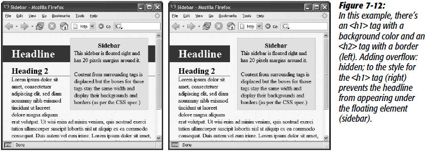
[figure source: CSS: The Missing Manual, by David Sawyer McFarland, Fig. 7-12/7-16, p. 172/222]
- the sidebar is floated to the right
- “the content below the sidebar moves up and wraps around it, just as it should”
- “but if that content has a background or border, that background or border appears underneath the floated sidebar”
- what is the z-order here?
- “in essence, a web browser wraps the text around the float, but not the border or background”
- to override this behavior, add
overflow: hidden ; to the style
- McFarland notes that this doesn’t work for all browsers, however
- alternatively, add a border to the floated element that is the same color as the background
To stop the wrapping caused by floats, use clear to force the element to drop below the previously floated element
clear: left ; /* clears elements floated left */clear: right ; /* clears elements floated right */clear: both ; /* clears elements floated left and elements floated right */clear: none ; /* this is normal float behavior */
See the wonderful tutorials in the book
- Tutorial: Margins, Backgrounds, and Borders (p. 175/225)
- Tutorial: Building a Sidebar (p. 181/233)
CSS Inheritance (CSS:TMM Ch. 4)
Classic inheritance vs. CSS inheritance
- derivation vs. encapsulation (nesting)
- CSS tags inherit properties from tags that surround them
- however, not all CSS properties are inherited, e.g., the
border property
General rules for CSS inheritance (CSS:TMM pp. 83-85/95-97)
- properties that affect the placement of elements on a page or the margins, background colors, or borders of elements are *not* inherited
- unless you do a CSS reset or specifically style elements with built-in styles like headers and anchors, browsers will use their own built-in styles on those elements
- when styles conflict, the more specific one wins out
CSS:TMM Appendix A lists all CSS properties and indicates which get inherited and which do not starting on page 463/563
Managing the Cascade (CSS:TMM Ch. 5)
The previous chapter and exercise introduced the cascade, this one goes into more detail
- these issues are not generally encountered when using CSS selectors in jQuery to create and manipulate elements
- however, they can cause major headaches when working with page layout, to which McFarland devotes three entire chapters (11-13) in the 2nd edition of his book, which has grown to four chapters (12-15) in the 3rd edition
- we most likely will not go that far in these sessions unless people specifically want to do so
As you saw in the previous exercise, inherited styles accumulate
- more than one style can apply to any specific element
- for most elements that do *not* have built-in styles, an element will have the style of the element(s) in which it is embedded (nested)
- the issue here is what happens when styles collide, for example, when two different ancestors say the color should be two different colors
Inheritance rules
- the nearest ancestor wins
- the style of the ancestor element that is physically closest to the element in question is the one that will dominate
- for example, the
body style might specifies the Verdana font, but a div style within the body might specify the Times Roman font
- any directly applied style will override any inherited style
- note that “directly applied” need not be
<tag style="...">
- it could be a style applied through an id or class selector, such as
<tag id="..." class="...">
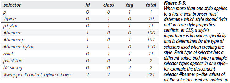
Specificity (CSS:TMM p. 96/108)
- the more specific a style, the higher its priority in being applied
- a tag selector is worth 1 point
- a class selector is worth 10 points
- an ID selector is worth 100 points
- an inline style is work 1,000 points
- this rule can be overridden by adding
!important at the end of a style
- however, this totally breaks the cascade, so it should only be used in dire situations

[figure source: CSS: The Missing Manual, by David Sawyer McFarland, Fig. 5-3, p. 97/109]
- inherited styles have no specificity
- therefore, directly applied styles always win
Other issues
- “Any external style sheets attached with the
@import rule have to appear before internal styles within a <style> tag.” (p. 98/110)
- added in the 3rd edition: “... and before any styles in an external style sheet.” (p. 110, 3rd ed.)
- “You can also fine-tune your design by selectively overriding styles on certain pages.” (p. 100/113)
It is impossible to memorize all these rules
- you have to simply gain familiarity with them as you work with them
- that said, it is worthwhile to review them once or twice and “put them in the back of our mind” so that you have some hope of understanding what’s going on when you encounter them
- this is an example of the underlying computer science that artists and web designers typically don’t worry about
- but it is our job to make pages efficient so that they
- display properly in as many browsers as possible without alteration or conditional code
- are maintainable when the company changes direction or the designers simply change their minds
- contain reusable code so that we can get home for dinner at a reasonable hour